- Ariyh
- Posts
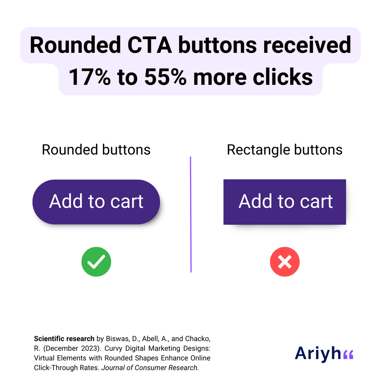
- Rounded CTA buttons drive more clicks
Rounded CTA buttons drive more clicks
Curved CTA buttons received 17% to 55% higher clicks (CTR) than buttons with sharp angles
Thomas McKinlay
April 09, 2024
Topics: Website/App | Ecommerce
For: B2C. Can be tested for B2B
Research date: December 2023
Universities: University of South Florida, University of Tennessee & Neighborly
New to Ariyh? This is a 3min practical summary of a scientific study 🎓Subscribe for $0 to get a new science-based marketing insight every week 📈
📝 Intro
Call-to-action (CTA) buttons are everywhere. You clicked one when subscribing to Ariyh, and every day click or tap more than you probably realize.
Because they usually trigger the actions we most want to drive as marketers (e.g. add to cart, buy, subscribe), we spend a lot of energy finding ways to make them more effective. For example:
What words should they contain (e.g. you)?
Should they be quantity-focused (e.g. add 1, add 2, add 3)?
What color should they be?
Today’s study found the most effective shape for them.
P.S.: Using rounded, curved shapes or straight, structured designs also impacts how your brand is perceived - whether it’s viewed as safe and reliable or exciting and fun.
📈 Recommendation
On your website and in your display ads, use curved designs or rounded edges for your CTA buttons. Rounded designs are more appealing, so people will be more likely to click.
If your CTA is centered around avoiding something (e.g. opting out) or promoting a negative action (not doing something), it doesn’t matter whether the button uses sharp edges or is rounded.
🎓 Findings
CTA buttons with rounded or curved edges (oval-shaped buttons or rectangles with rounded corners) generate higher click-through rates (CTRs) than buttons with sharp edges (normal rectangle or square shapes with 90-degree edges).
As part of 8 experiments, researchers found that when using rounded CTA buttons vs sharp-edged ones:
A restaurant ad received a 24.6% higher CTR and people were 16.8% more likely to click to order food online.
A landing page for an event planning tool had a 55.5% higher CTR.
Students in a lab study were 46% more likely to click a button to take an extra survey.
Customers put 25.7% more into their basket when shopping for smartphone accessories online.
In an eye-tracking experiment, people looked at the button for 28.6% longer and their gaze returned to the button 61.8% more.
If the CTA calls for a negative action or avoiding something (e.g. “Click to unsubscribe”), there’s no difference in the impact of a rounded or sharp-edged CTA.
🧠 Why it works
We prefer round shapes because we associate roundness with friendliness and harmony. We associate sharp angles with threats and toughness.
We like to approach objects that we find more attractive, so we are more likely to click on buttons that are rounded.
💻 Brought to you by Storyblok
Want a faster, more effective way to run your website?
Try Storyblok - the next generation headless CMS:
Edit your website as you browse it
Launch new landing or product pages in minutes
Create content once, publish across all your channels
Try it out yourself for free - no credit card required.
This announcement was sponsored. Want your brand here? Click here.
✋ Limitations
The study looked at CTA buttons in isolation. In real-world situations, the reaction to CTA buttons would also be impacted by factors like the design grid of the site, and the brand’s positioning and content on the page.
The research looked at online ads, landing pages, and e-commerce. It did not test CTA buttons on social media (e.g. Instagram stories, reactions to Facebook posts).
🏢 Companies using this
Companies currently use a mix of curved and angled CTA buttons. The shape of the CTA appears to follow the general design of the website (structured, straight lines vs. unstructured, curved shapes), rather than optimizing CTA buttons.
Retail giant Walmart changed their CTA buttons in 2020 to opt for curved edges instead of straight lines, but many others continue to use straight angles for their CTAs - both on their website and banner ads.
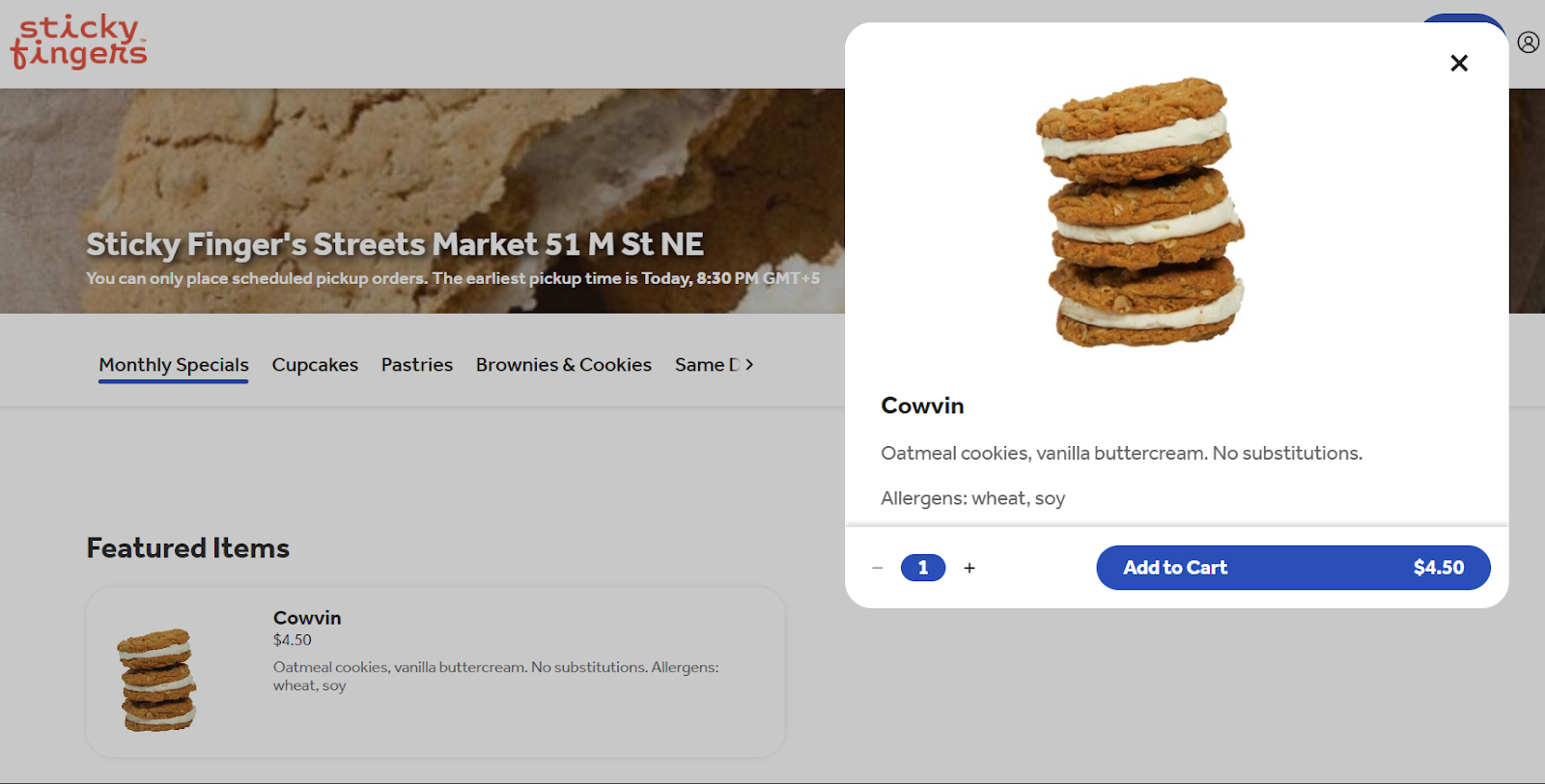
NY bakery Sticky Fingers uses curved buttons throughout its website.
⚡ Steps to implement
Use curved edges (instead of straight angles) on your CTA buttons. Instead of having 90-degree angles in the corner of your buttons, introduce a curve, or use an oval shape for the button instead of a rectangle.
This can include everything from buttons to place orders, request more information, or submit a form.
You can also add an option for your customers to decide the quantity they want on these curved CTA buttons. This can increase total sales as well as individual conversions.
For buttons centered on avoidance-related actions (e.g. Opt-out) or negative framing (e.g. Declining an offer), you can use either rounded or straight edges (like 90-degree angles) for your buttons.
🔍 Study type
Lab and online experiments and field experiments (A/B test with 945 clicks of a Google Ad for a restaurant and 919 clicks on the landing page for an event planning app)
📖 Research
Curvy Digital Marketing Designs: Virtual Elements with Rounded Shapes Enhance Online Click-Through Rates. Journal of Consumer Research (December 2023).
🏫 Researchers
Dipayan Biswas, University of South Florida
Annika Abell, University of Tennessee
Roger Chacko, Neighborly
Remember: This is a new scientific discovery. In the future it will probably be better understood and could even be proven wrong (that’s how science works). It may also not be generalizable to your situation. If it’s a risky change, always test it on a small scale before rolling it out widely.
🎓 Found this insight useful?
Subscribe to Ariyh for free to get a new marketing insight like this every week
Want to instantly unlock access to hundreds of insights (and more)? Subscribe to Ariyh Pro